We’ve lost count of how many homepages we’ve rebuilt at Lens Digital. What we haven’t lost count of is the mistake almost every one of them made before we got to it: they talked about the business first, and the visitor second.
That’s it. That’s the whole problem, dressed up in a hundred different ways – fancy sliders, stock photos of people in suits shaking hands, headlines like “Welcome to [Company Name].” All symptoms of the same thing: a homepage built to describe the company, not to speak to the person looking at it.
After enough of these rebuilds, a pattern emerged. The homepages that actually worked, the ones that turned visitors into enquiries, all followed roughly the same structure, in roughly the same order. So we stopped reinventing it every time and turned it into a framework. Here it is, in full, worked through using a business we deal with all the time: an accountant. Swap the specifics for your own and you’ll see how it holds up.
The Sections
1. The Hero Screen
This is the only part of your homepage guaranteed to be seen by 100% of visitors, which makes it the most over-thought and under-delivered section on the internet.
The headline’s job is to describe the visitor’s problem, not your service. “Chartered Accountants Serving Berkshire” tells someone what the business is. It does nothing to tell them it understands them. Compare that to something like “Still doing your own bookkeeping at 11pm on a Sunday?” One of those gets skimmed past. The other gets read, because it’s describing a Sunday the visitor has actually had.
The sub-headline is where the solution goes – as an outcome, not a features list. Not “We offer bookkeeping, payroll and tax return services” (fine, but so does every accountant within twenty miles). More like “we take the numbers off your plate, so your evenings go back to being your own.”
Then, one clear button. Not three. Every extra choice at this point is friction, not flexibility.
2. The Problem You Solve
Most homepages skip straight from Hero to “Our Services” which is a bit like an accountant skipping the conversation about what’s actually keeping a client up at night and going straight to a price list.
Before you talk solutions, prove you understand the problem, in specific, recognisable detail. Not “managing your own accounts is time-consuming,” but the actual, felt cost of it – a missed VAT deadline that triggers a fine, hours lost every month to a spreadsheet that never quite balances, or the quiet dread of not really knowing if the business is profitable until the accountant says so at year end.
Get this section right and the visitor you will have engaged before they’ve even reached your services.
3. The Solutions You Offer
Here’s where most sites default to a list of services with a one-line description each. Fine, but forgettable. The better version frames each service around what it fixes, not what it includes.
Bookkeeping isn’t “accurate, up-to-date records” – it’s “always knowing where you stand, without opening a spreadsheet.” Tax returns aren’t “efficient tax return preparation” – it’s “one less deadline you have to carry in your head.” Advisory isn’t “strategic business guidance” – it’s “someone in your corner before a decision, not just tidying up after it.”
4. The Work You've Done
A gallery of pretty screenshots proves you can use a colour palette. A case study proves you can solve a problem.
For an accountant, that might be: how a client’s month-end reporting went from a five-day scramble to a same-day summary, or how a switch to proactive tax planning saved a client a specific amount last year.
Two or three real examples – the before, the after, and one number that moved – will outperform any generic “About Our Firm” paragraph every time.
5. Social Proof
Testimonials floating in isolation, unattached to any result, tend to get skimmed and forgotten. Put them next to the case studies they relate to instead. And if you’re picking between logos, a handful of small local businesses often carries more weight with a visitor than one big, recognisable name with no context – a café owner trusts proof from another café owner more than from a corporation they’ll never resemble.
6. Why Work With Us
This is the section almost every homepage wastes. “Experienced, friendly, professional service” – sure, and so is every other accountant’s about page. This is your one chance to say something an outsider couldn’t have written for you. What do you believe about your industry that most competitors won’t say out loud? For an accountant, it might be: we think most firms only talk to their clients once a year, at tax return time and that’s exactly why so many businesses find out too late that they could have planned better. Say the thing. It’s more memorable than any adjective.
7. The Call to Action
Don’t end on a flat “Get in touch.” Echo the promise from your hero section instead, so the whole page feels like it’s been building toward one point. Something like: “Ready to stop dreading the numbers and start understanding them?” Then the button.
Pulling It All Together
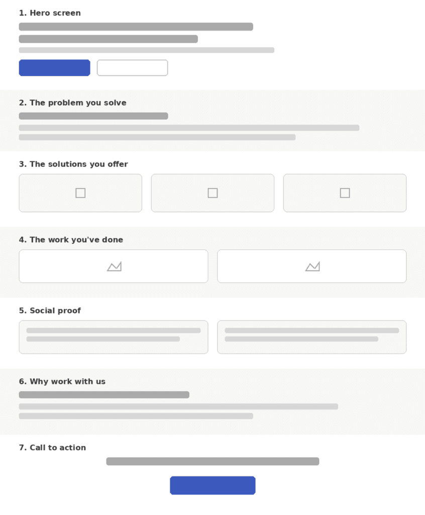
When you pull that all together, it looks something like the wireframe below. As you can see, the layout walks your website visitors through the problem they face, the solution you offer and how you know what you are talking about.
The layout and titles are only a suggestion and should be tweaked to your specific website.
Why we built it this way
None of this is theory. It’s the shape that kept showing up, project after project, once we stopped asking “What do we want to say about ourselves” and started asking “What does this visitor need to feel, in order, before they’ll trust us enough to enquire.”
Problem, then solution, then proof, then a reason to pick this business specifically. Every homepage we design for a client , whether they’re an accountant in Ascot or a tradesperson trading nationally, runs through this same structure, because the order isn’t decorative. Skip a step, or run it out of sequence, and the drop-off shows up in the data.
If you’re looking at your own homepage and it doesn’t hold up against this list – you’re not alone, and it’s a more common gap than you’d think, even on sites that look perfectly polished.
Want us to run your homepage through this framework for you? Get in touch with Lens Digital for a free homepage review – we’ll tell you exactly which of these seven sections is costing you enquiries, and how to fix it.